Controls
Here you can find a description of all the controls that can be added to a web app and how to configure them.
Scale bar
A scale bar to be placed on the bottom left of the map window. This control is enabled by default.
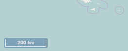
Scale bar
The following properties can be configured for this control:
| Option | Description |
|---|---|
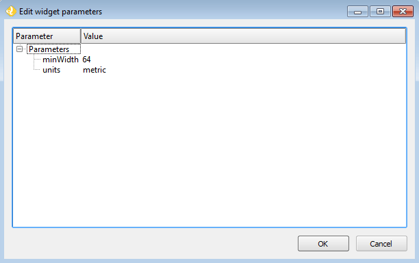
| minWidth | Minimum width, in pixels, of the scale bar. Default is 64. |
| units | The units to be used in the scale bar. Options are metric, degrees, imperial, nautical, and us. Default is metric. |
Scale bar configuration
Zoom
Buttons to zoom the map in and out. This control is enabled by default.
The following properties can be configured for this control:
| Option | Description |
|---|---|
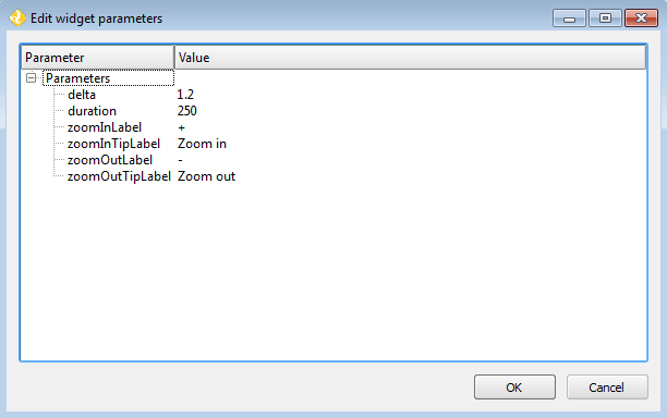
| delta | Default is 1.2. |
| duration | Length of time (in milliseconds) it takes to perform a zoom change. Default is 250. |
| zoomInLabel | The text to display on the Zoom In button. Default is +. |
| zoomInTipLabel | The text to display when hovering over the Zoom In button. Default is Zoom in. |
| zoomOutLabel | The text to display on the Zoom Out button. Default is -. |
| zoomOutTipLabel | The text to display when hovering over the Zoom Out button. Default is Zoom out. |
Zoom configuration
Layers list
A control with the list of layers in the map. This control is enabled by default.
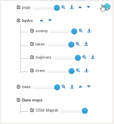
Layers list
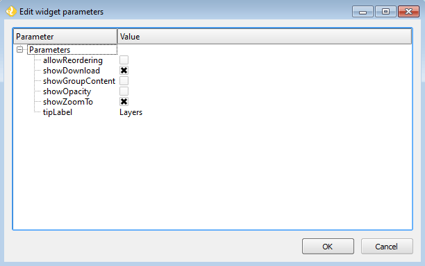
The following properties can be configured for this control:
| Option | Description |
|---|---|
| showOpacity | Show opacity slider for each layer. |
| showZoomTo | Show Zoom To button, so the user can adjust the extent of the map based on the extent of an individual layer. |
| showDownload | Show Download button, so the user can download the layer in GeoJSON format (vector layers only). |
| allowReordering | Allows the user to change the rendering order of layers by dragging them. |
| allowFiltering | Allows the user to set filters for conditional rendering. A filter button is added to each vector layer entry in the layers list, which opens the following dialog: 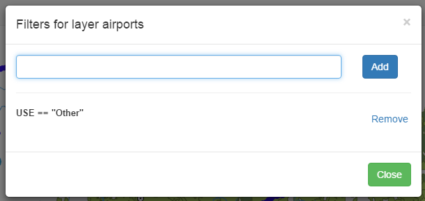
Layer filters Layer filters are added as filter expressions, using the notation accepted by the Filtrex library. |
| tipLabel | The tooltip to show when mouse is hovered over the layers list. Default is Layers. |
Layers List configuration
Legend
Adds a legend explaining the symbology used in the web app.
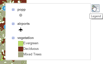
Legend
A legend entry will be added for all vector and WMS layers. Raster layers will not have an entry in the legend.
Overview map
An additional map that shows a larger overview of the extent of the area covered by the app.
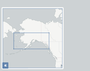
Overview map
The following properties can be configured for this control:
| Option | Description |
|---|---|
| collapsed | If checked, the overview map will not be shown when the app is launched. Default is checked. |
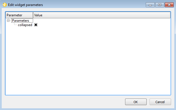
Overview Map configuration
North arrow
An arrow that indicates the north direction.

North arrow
There are no configurable properties for this control.
Full screen
A button to toggle the full screen mode.
There are no configurable properties for this control.
Attribution
Adds an attribution note on the bottom right of the map.
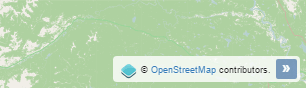
Attribution
There are no configurable properties for this control.
Zoom slider
Adds a slider bar to control the zoom level.
There are no configurable properties for this control.
Home button
Adds a button to return to the initial map extent.

Home button
There are no configurable properties for this control.
Mouse Position
Adds a control that displays the current coordinates of the mouse as it moves over the map.
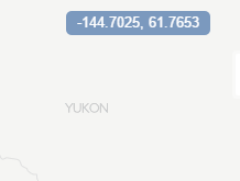
Mouse Position
The following properties can be configured for this control:
| Option | Description |
|---|---|
| coordinateFormat | OpenLayers string format. Default is ol.coordinate.createStringXY(4). |
| Projection | The CRS to use when determining the units. Default is EPSG:4326. |
| undefinedHTML | The text to show when the coordinate cannot be computed. Default is or a blank. |
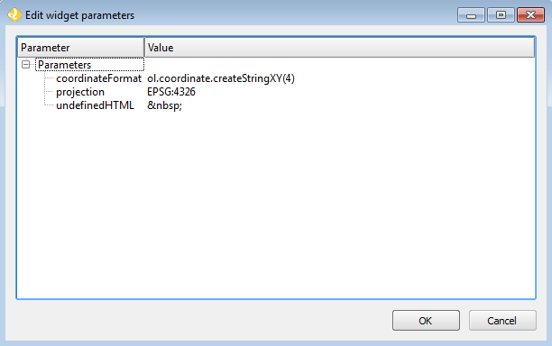
Mouse Position configuration
Geolocation
Enable geolocation and uses the current position of the user in the map.
There are no configurable properties for this control.
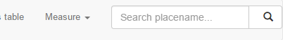
Measure
Adds area and length measure tools to the map.
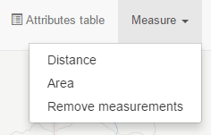
Measure Tools
There are no configurable properties for this control.
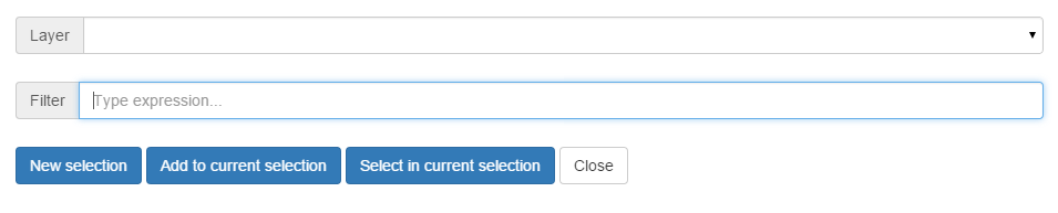
Selection
Adds the ability to select features on the map in a few different ways.
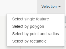
Selection options in the app
The following properties can be configured for this control:
| Option | Description |
|---|---|
| Select by polygon | Adds an option for selecting via drawing a polygon on the map. Default is checked. |
| Select by rectangle | Adds an option for selecting via drawing a rectangle on the map. Default is checked. |
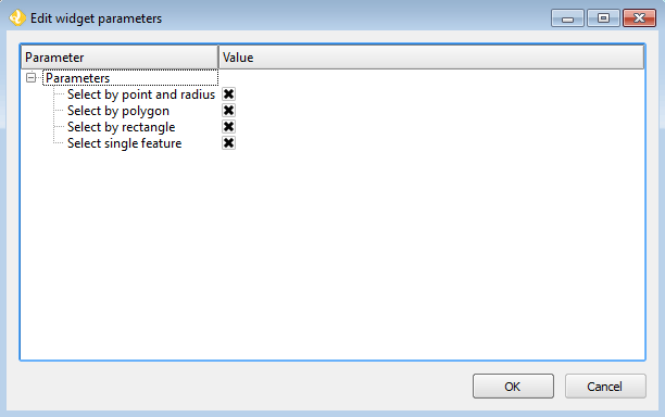
Selection configuration
Attributes table
Adds the ability to display a table containing the attributes of the features in a given layer. Features can be selected/deselected clicking on the table rows. Multiple selection is available using the shift and ctrl keys. Selected features for the layer are shown in a different color.
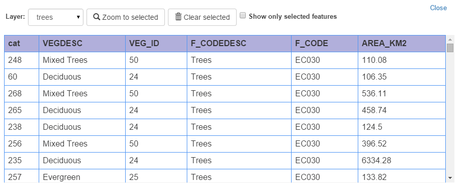
Attributes table
If a rendering filter is defined for the layer, those features that are not visible are rendered in a lighter color in the attributes table.
There are no configurable properties for this control.
Charts
Allow for the creation of charts based on selected features of a layer.
The following properties can be configured for this control:
| Option | Description |
|---|---|
| Chart name | The title of the chart. |
| Display mode | Defines how the feature attributes will be used to create the chart. The following options are available:
|
| Layer | The layer from which to choose features. |
| Layer field | The layer to use for the chart. |
| Category field | The attribute to use for the chart. |
| Add/Modify | After all the other fields have been populated, this button will add the info to the chart, visible in the right side of the dialog. |
| Remove | Will remove given info from the chart. |
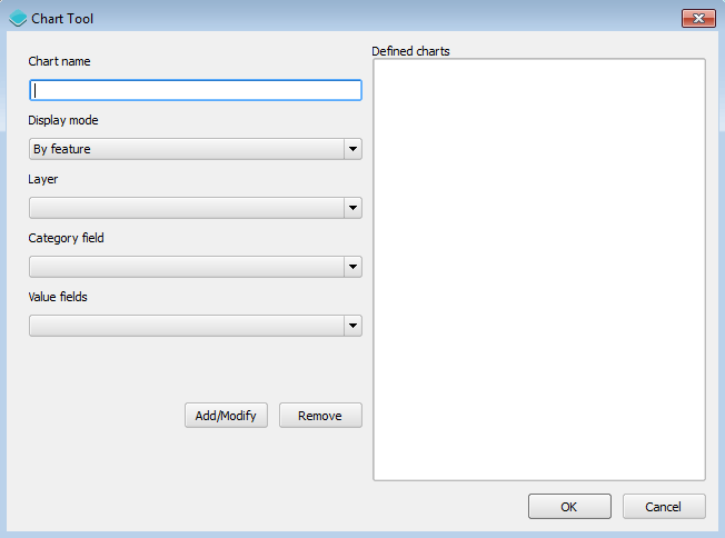
Chart Tool configuration
Geocoding
Adds geocoding functionality to locate geographic places by name.
Geocoding tool
There are no configurable properties for this control.
Query
Adds query tools to perform selections in layers. Queries are expressed using the notation accepted by the Filtrex library.
Query tool
There are no configurable properties for this control.
Bookmarks
Adds the ability to create and retrieve spatial bookmarks. A spatial bookmark consists of a name, an extent and a description.
When this tool is enabled, a Bookmarks entry will be created in the app.
There are two options for defining bookmarks:
- Using QGIS bookmarks. Click Add from QGIS bookmarks and in the dialog that will appear, select the bookmarks to use from the ones currently stored in the QGIS database. Since those bookmarks do not contain a description, but just name and extent, you should define the description manually, typing it in the Description box for each bookmark.
- Using a vector layer. A new bookmark will be added for each feature in the layer, using the bounding box of the feature geometry as the bookmark extent. The name and description of each bookmark will be taken from two attributes in the layer.
The Configuration tab controls how the bookmarks will be displayed. If the Show as story panel box is checked, a narrative map will be created, and a panel to browse across bookmarks will be added to the web app. Otherwise, bookmarks will be shown as menu entries in the navigation bar, under a Bookmarks menu.
Timeline
Adds a slider to the map that can be used to select a given date, and modifies the visibility of layers and features depending on their timestamp and the current time.

Timeline slider
Clicking on the play button will cause the slider to advance automatically. The behaviour of the auto-play mode can be modified using the available options for this control:
- numInterval. The number of intervals into which the full range of the slider is divided
- interval. The time, in milliseconds, to wait in each position of the slider. Positions are defined by dividing the slider range by the number of intervals defined in the above parameter
About panel
Adds a button which toggles a translucent text panel over the map, usually describing the app.
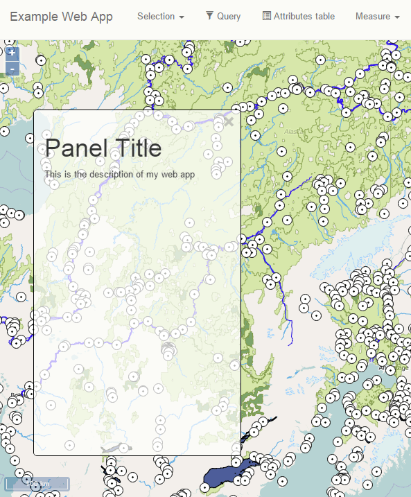
About panel
The following properties can be configured for this control:
| Option | Description |
|---|---|
| content | The content of the panel. Accepts HTML formatted text. Click Edit to open a text editor. |
| isClosable | When enabled, the user can close the panel. |
| showNavBarLink | When enabled, adds a link in the navigation bar to reopen the panel if it is closed. |
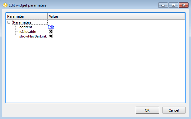
About panel configuration
Export as image
Adds an option to export the current map view to an image file.
There are no configurable properties for this control.
Links
Adds links to external sites to the navigation bar. Each link is defined with a name (shown in the navigation bar) and a URL.
The following properties can be configured for this control:
| Option | Description |
|---|---|
| Add link | Adds a new link |
| Remove link | Removes a link from the list |
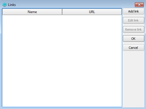
Links configuration
Help
Adds a link on the menubar to a help page.
There are no configurable properties for this control.
Add layer
Adds a menu entry that can be used by the web app user to add a layer to the map. Only vector layers can be added. Supported formats for layers are GeoJSON, GPX and KML.
There are no configurable properties for this control.
Print
Adds printing capabilities to the web app.
Printing layouts are designed using the QGIS Print Composer. The Web App Builder will take the exisiting print compositions from the current project, and make them available to users of the web app. The web app will generate maps in PDF format using the layout designs created in QGIS, and allowing the user to configure certain parameters, such as the extent of the map of the content of text labels.
Most elements are supported, including legend, arrow, shape, label and scalebar. If any of the print compsitions in the current project contains an element that it is not supported (such as, for instance, an attributes table), a warning will be shown before the web app is created.