Mapping French schools
This tutorial shows how to create a web app using a layer with data for schools in France. By allowing the user to select features in that layer and then create graphs and statistics, the distribution of names can be analyzed, which turns this app into an interesting tool to analyze the story of the French education system.
This app was inspired by a similar work published in an article in La Monde.
Data
Download the data for this tutorial.
The layer contained in this archive is a collection of schools, based on the original data from the article linked above. This was converted to a shapefile, with attribute field names translated into English. Some entries were removed to reduce the size of the file.
Also, only schools in metropolitan France are considered to simplify handling projections, as the original data had coordinates using several CRSs in the same file.
Preparing the application in QGIS
The first step in building a web app using the Web App Builder is to set up our project in QGIS.
Open the QGIS project included in the exercise data.
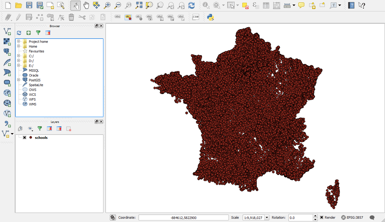
Schools QGIS project
The project contains one layer with a rather basic styling. We don’t need to add more complex styling, as our web app is more about the data analysis than the map itself, so we will leave it as is.
If you’d like, zoom into any place you would like to use as your initial extent. When the web app is loaded, it will be focused on that area.
Configuring the application
Start the Web App Builder by selecting . This will bring up the interface used to configure our web app. There are several tabs, each one used to define a particular set of parameters. We will go through each of them and describe their meaning.
In the Description tab, fill out the form with the following:
Enter
Mapping French School Namesin the App Title box.Leave the Logo image box empty.
Select the basic theme.
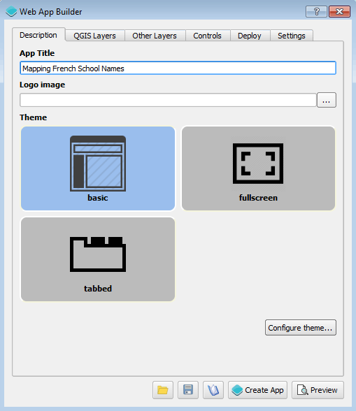
Description tab
In the QGIS Layers tab, fill out the form with the following:
We only have one layer, so make sure that the schools layer is checked.
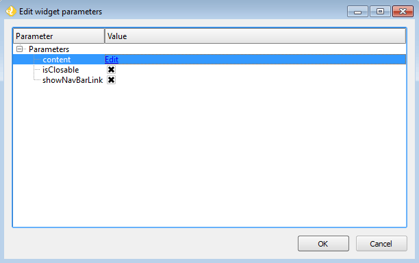
Click on the Edit link to edit the content of the popup for the layer.
Enter
[NAME]in the text box to display the name in the popup when the feature is clicked on the map.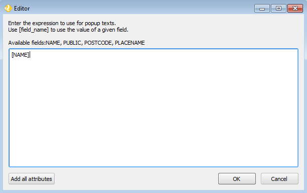
Popup editor
Click OK to close the dialog.
Check the Allow selection on this layer box. This is important, since we want the user to be able to select schools, and then create their own custom charts based on that selection.
Check the Cluster points box. Since the number of features is large in the schools layers, clustering will ensure that the web app has good performance when rendering at a large scale. The default clustering distance is fine, so there is no need to modify it.
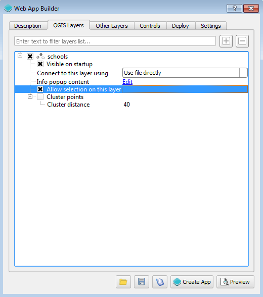
Layers tab
In the Other Layers tab, select the MapQuest aerial layer as the base layer to use. Leave all others unselected.
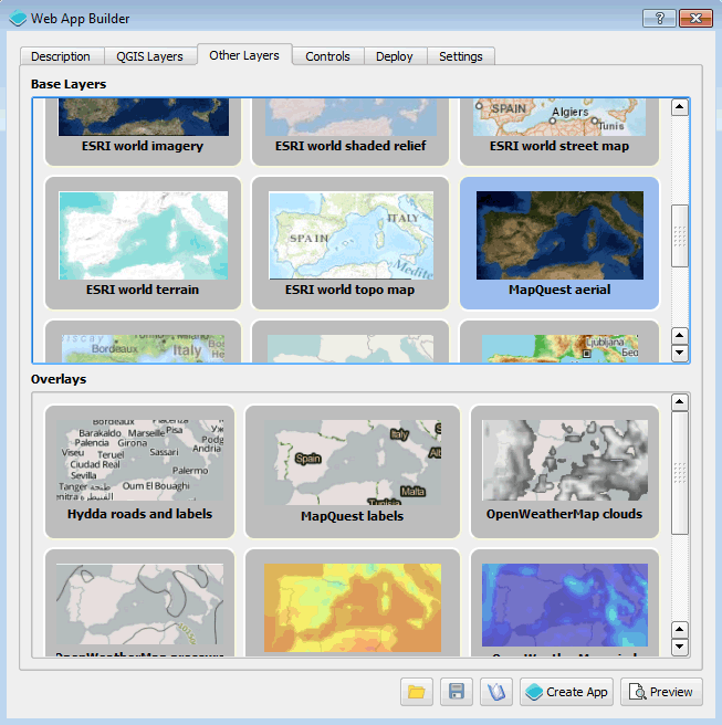
Other Layers tab
In the Controls tab:
- For our web app, we will leave the default three controls activated (Scale Bar, Zoom, Layers) and add the following:
- Selection
- Attributes table
- Charts
- Query
- About panel
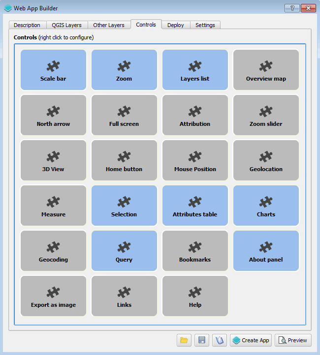
Controls tab
Right-click Charts and select Configure.
Here’s where we define how to produce the charts when the user makes a selection in the layer. We want to count the number of schools with the same name, so in the Display mode list, select Count by category.
Categories are defined by school names, so the NAME field has to be selected in the Category field list.
Enter
Count By Namein the Chart Name box, and click Add/modify to add it to the list of charts that will be available in the web app.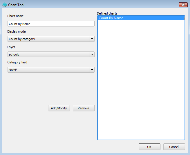
Chart tool
Click OK to finish configuring the Chart tool.
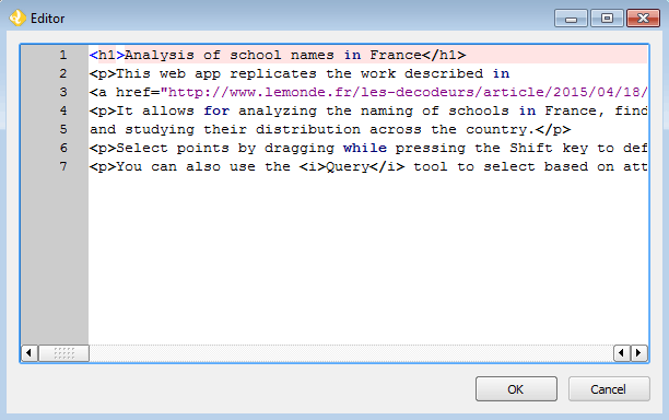
Right-click About panel and select Configure.
Click the Edit link to open the text editor.
The content of the panel is defined using HTML. Enter the following in the text editor:
<h1>Analysis of school names in France</h1>
<p>This web app replicates the work described in
<a href="http://www.lemonde.fr/les-decodeurs/article/2015/04/18/de-jules-ferry-a-pierre-perret-l-etonnant-palmares-des-noms-d-ecoles-de-colleges-et-de-lycees-en-france_4613091_4355770.html">Le Monde</a>.</p>
<p>It allows for analyzing the naming of schools in France, findinf out the most common ones
and studying their distribution across the country.</p>
<p>Select points by dragging while pressing the Shift key to define a rectangle.</p>
<p>You can also use the <i>Query</i> tool to select based on attributes.</p>
About panel editor
Click OK to close the text dialog.
Leave all other parameters as-is, and click OK to close the About panel parameters dialog.
About panel parameters
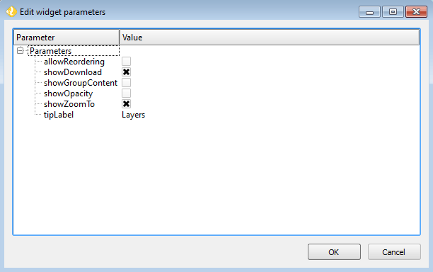
Right-click Layers and select Configure.
Check the showDownload check box. That will give the user the option to download the schools layer as a GeoJSON file.
Check the shownZoomTo check box. This will give the user the option to fit the extent of the view to the layer extent.
Leave all other parameters as-is, and click OK to close the dialog.
Layers list parameters
- For our web app, we will leave the default three controls activated (Scale Bar, Zoom, Layers) and add the following:
Note
There is no need to edit any of the parameters in either the Deploy or Settings tabs.
Creating the application
Save the application configuration by clicking the Save (disk) icon at the bottom of the dialog.
With the configuration defined, we can now create it by clicking the Create App button at the bottom of the Web App Builder dialog.
Select the directory where you want to store the web app.
The app will be created and saved in this directory. When finished, a dialog will display.
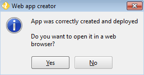
App successfully deployed
Click Yes to see the deployed app.
Customizing the application code
The code of the application is now in the selected directory and the web app is fully functional. The generated code can be edited to suit our needs. We will do one small modification.
In a text editor, open
resources/tools.jsfrom the directory where you stored the web app.Scroll down to around line 650, where you will see:
for (i = 0; i < sorted.length; i++) {
    columns[0].push(sorted[i][0]);
    columns[1].push(sorted[i][1]);
}
The code takes all the count values and uses them for the chart bars. That might not be a good idea, since there might be too many of them, and in most cases would just be equal to 1 (since most names might just appear at a single school). It is more interesting to focus on those names that appear in several schools, meaning to focus on the categories that have larger count values.
Replace the above code with the following:
for (i = 0; i < Math.min(sorted.length, 30); i++) {
    columns[0].push(sorted[i][0]);
    columns[1].push(sorted[i][1]);
}
This will generate more informative charts.
Save and close the file.
Refresh the app in the browser.
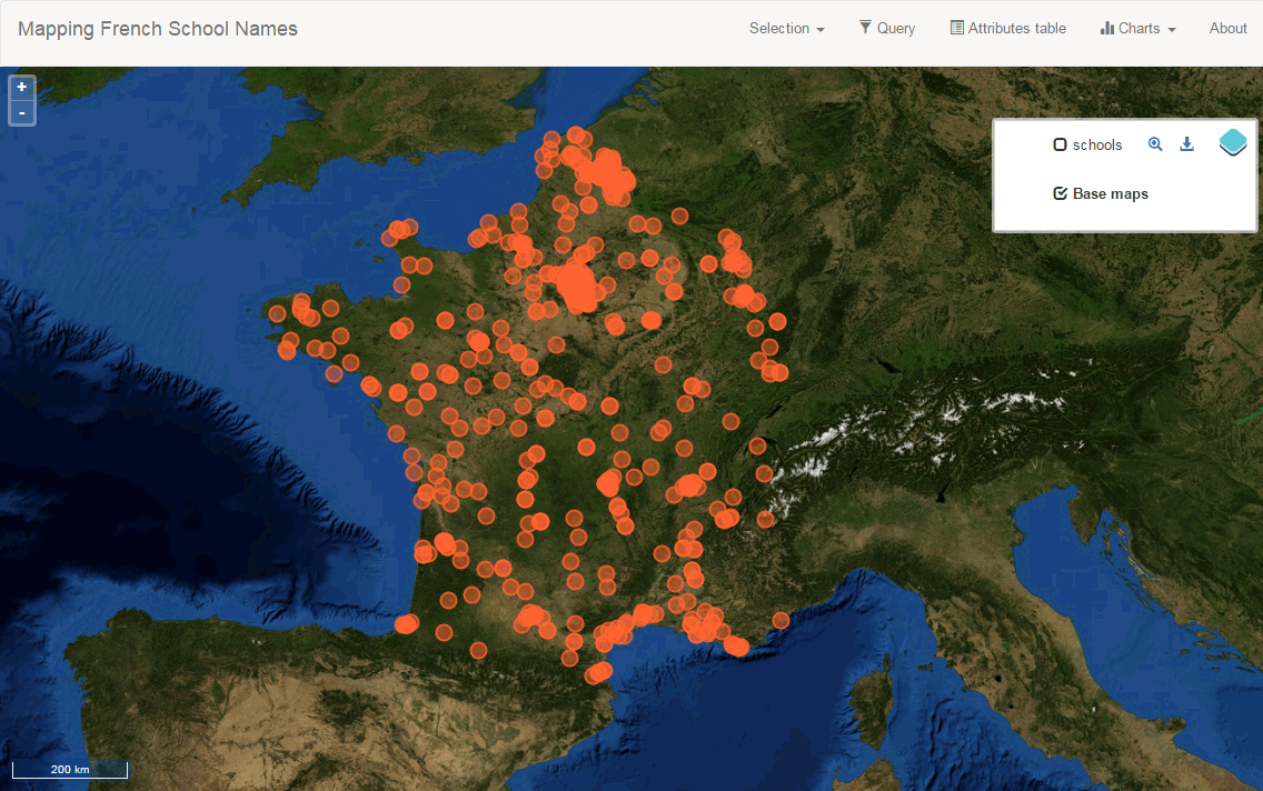
Final result
If not already open, launch the app by opening index.html file inside the directory where you created your web app.
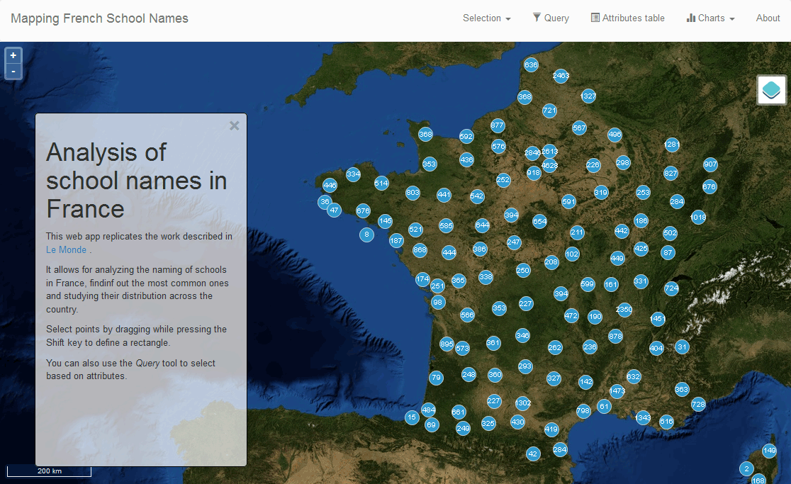
Deployed app
Using the application
Here are some ways you can test the application’s functionality:
Querying
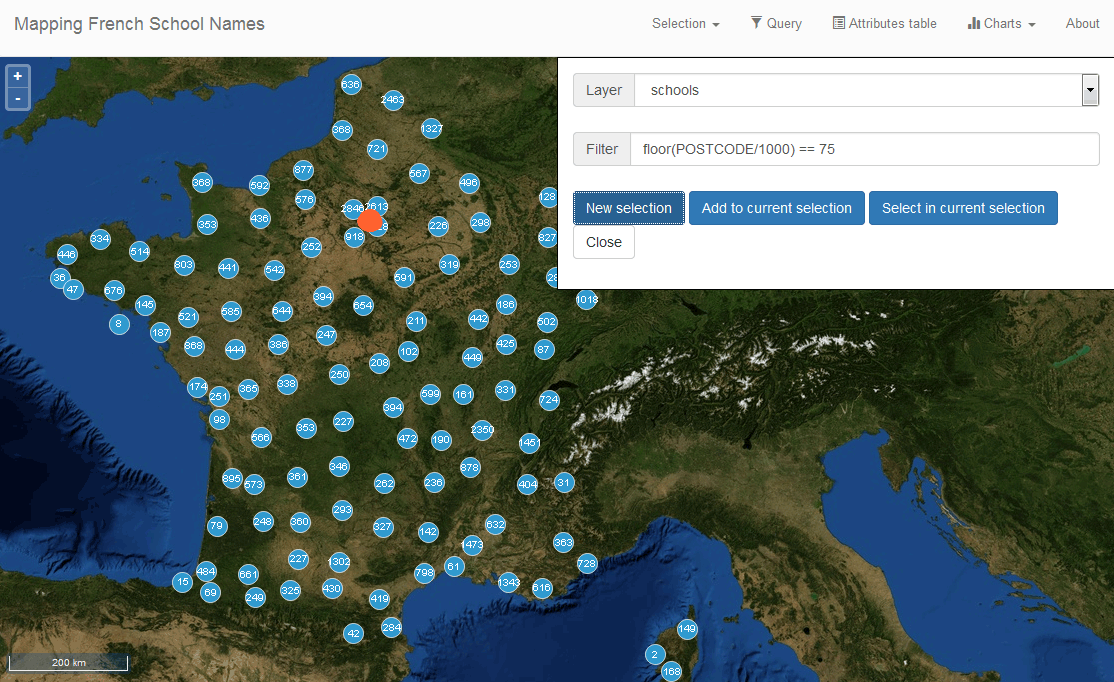
French departments (departements) are usually referred to by a number. Paris for instance, is referred to as number 75. Postal codes on the department always start with the department number, so we can select all schools in Paris by selecting those ones in the form 75XXX.
Open the Query tool and enter this in the filter field:
floor(POSTCODE/1000) == 75
Click New selection. The Paris schools will be highlighted. Unlike the unselected schools in the schools layer, selected ones are not clustered.
Schools in Paris
Now close the Query tool and open the Count by Name chart:
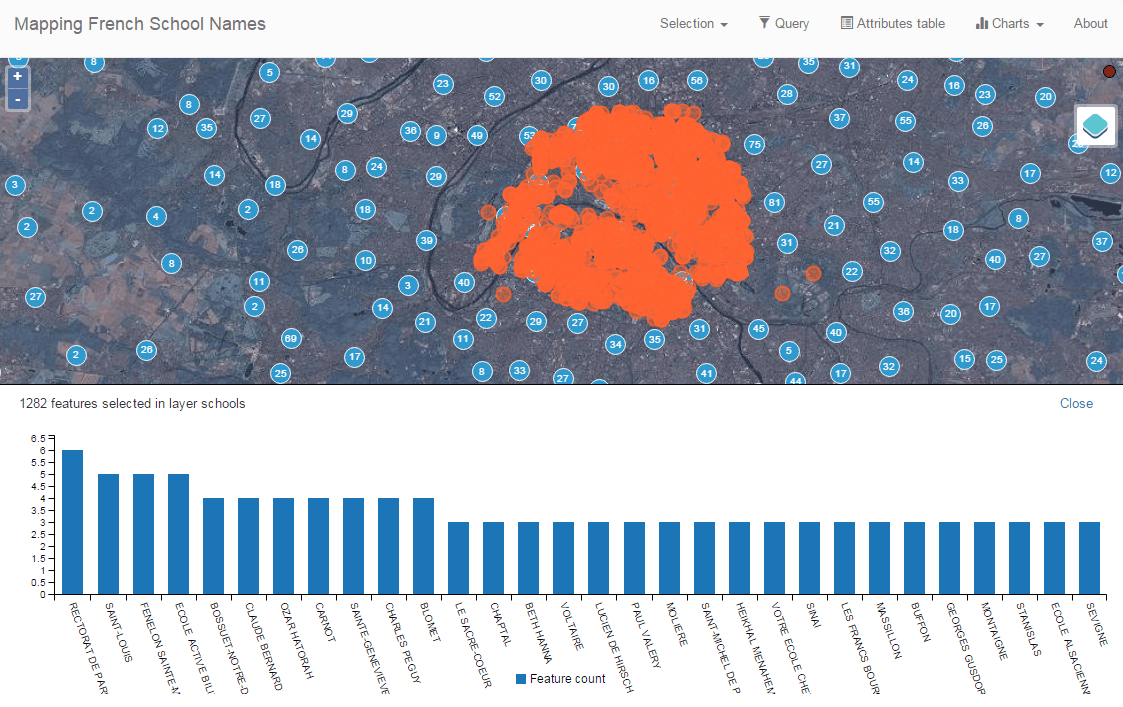
Schools in Paris, charted
To see the attributes associated with each school, close the Chart panel and open the Attributes table:
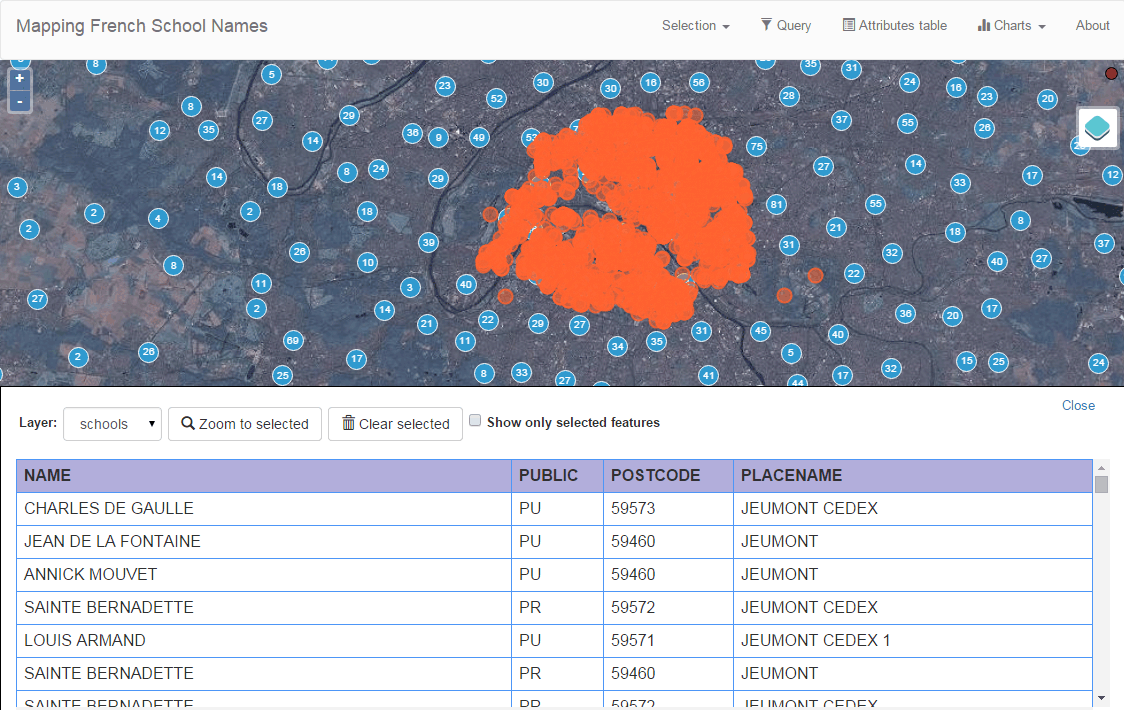
Attributes
Group selection
Here is a more complex example. Let’s select all public schools in the Ile-de-France region, which includes Paris. The department numbers in the region are 75, 77, 78, 91, 92, 93, 94, and 95.
Enter the following expression in the Query tool and click New selection:
floor(POSTCODE/1000) in (75,77,78,91,92,93,94,95) and PUBLIC == "PU"
Open the Chart tool and you will see something like this:
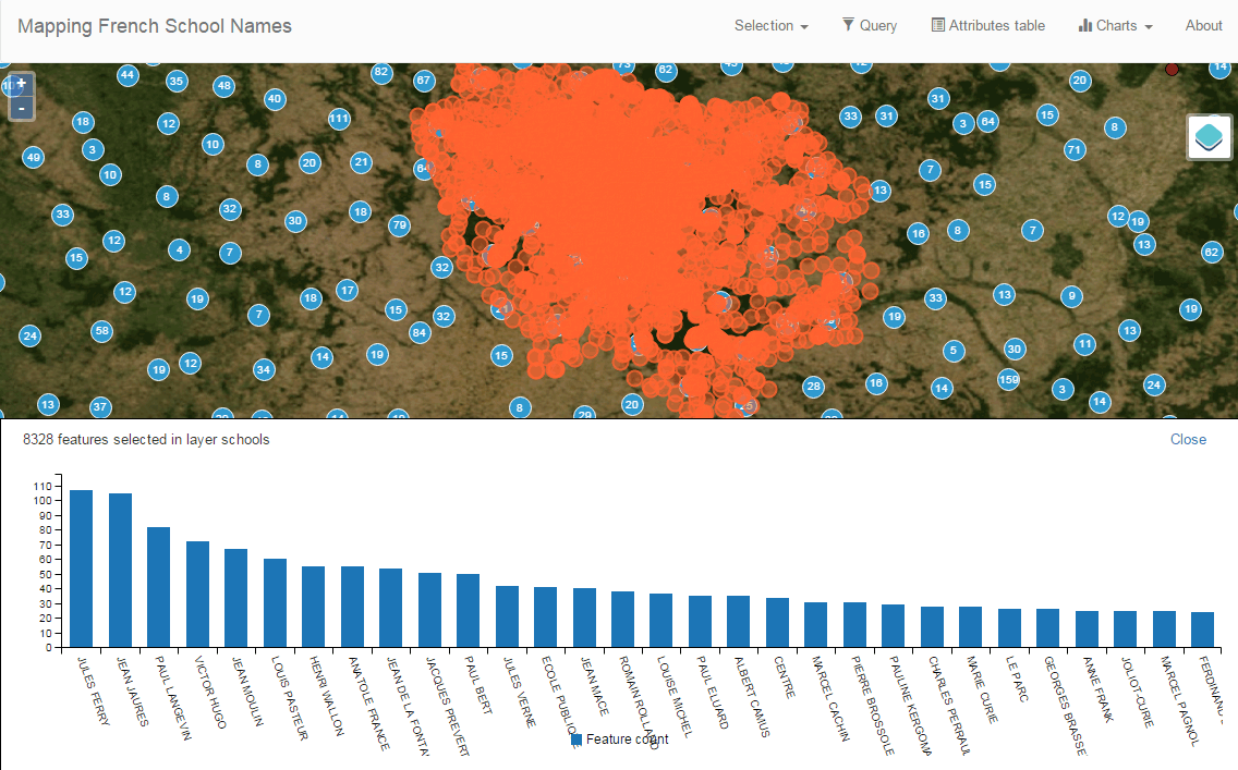
Schools in Ile-de-France
Selection/filtering by name
You can also show only the location of schools with a given name using a trick.
The selected features are in a separate layer which is not shown in the Layers list. That means that if you turn off visibility for the schools layers the layer with selected elements will still be in the map.
Enter the following in the query box and click New selection:
NAME == "JULES FERRY"
In the Layers list, uncheck the Schools layer. You should now see something like this:
Schools named “Jules Ferry”